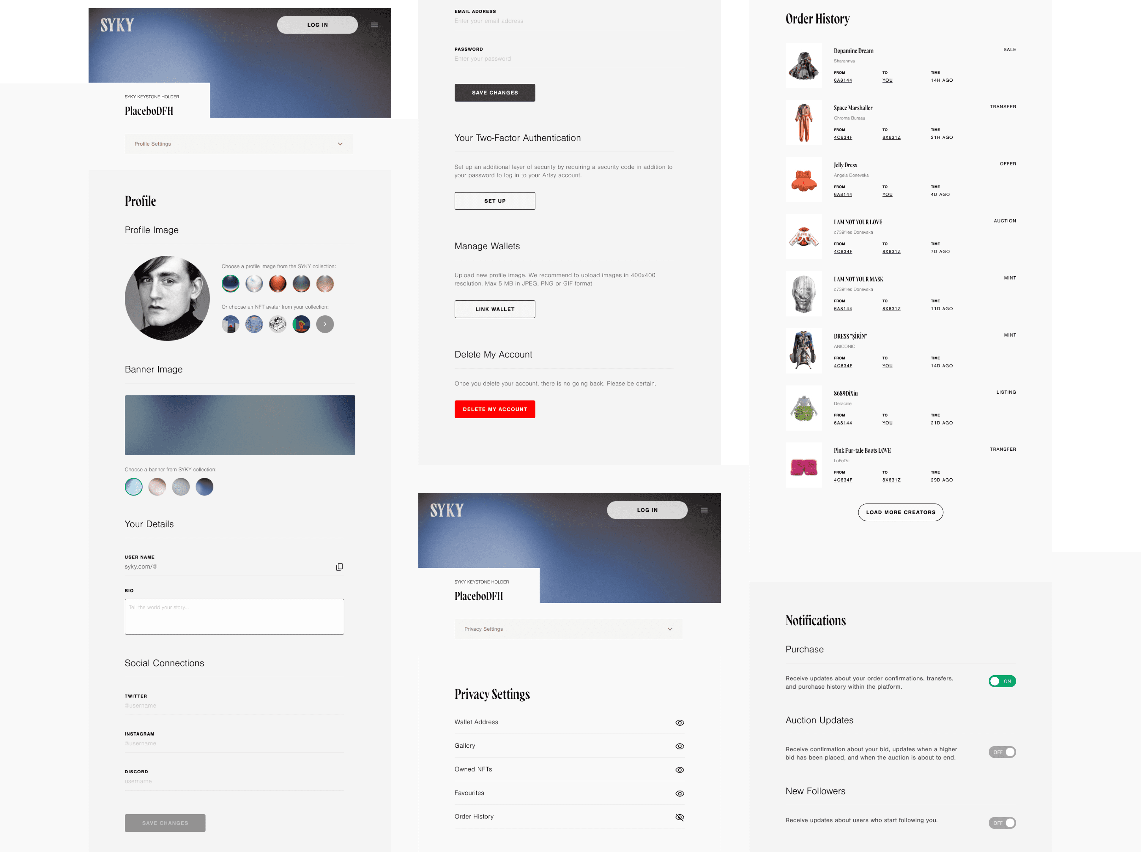
SYKY — pronounced “psy-che” — is a new Web3 platform designed to support creatives who are looking to sell both physical and digital renditions on their designs, as well as offering a space to trade products, share news, and chat.
SYKY — pronounced “psy-che” — is a new Web3 platform designed to support creatives who are looking to sell both physical and digital renditions on their designs, as well as offering a space to trade products, share news, and chat.
SYKY — pronounced “psy-che” — is a new Web3 platform designed to support creatives who are looking to sell both physical and digital renditions on their designs, as well as offering a space to trade products, share news, and chat.
Design Direction, UX & UI


Brief
Brief
Brief
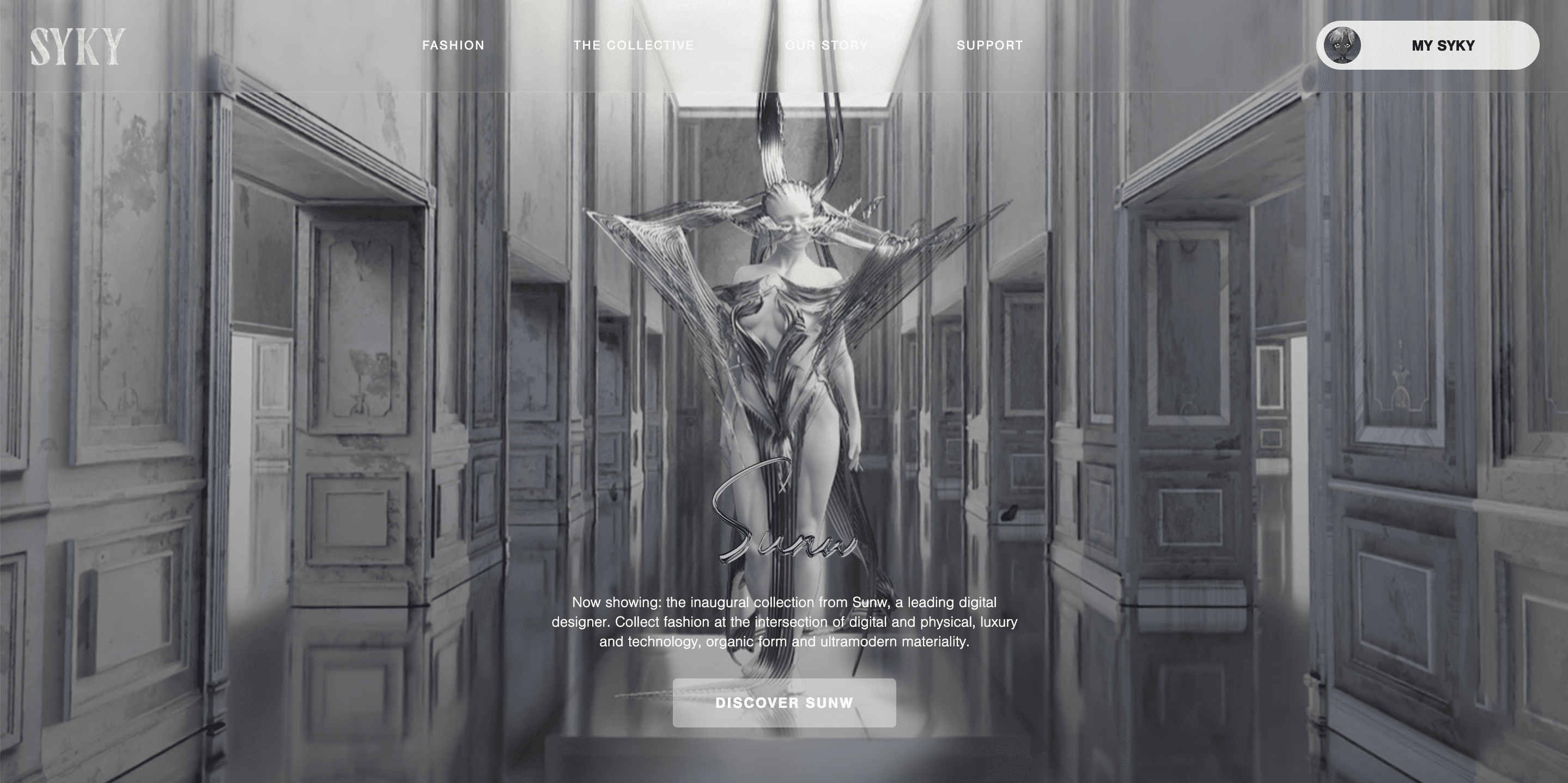
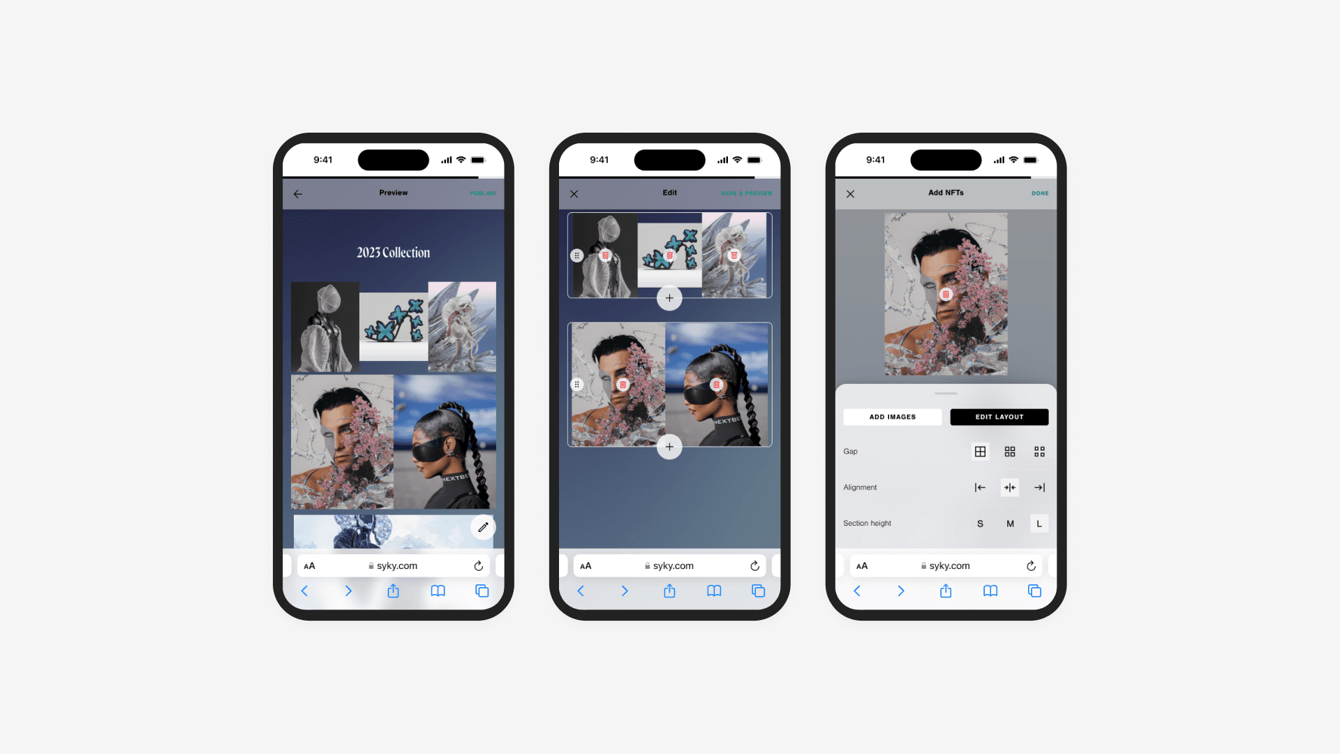
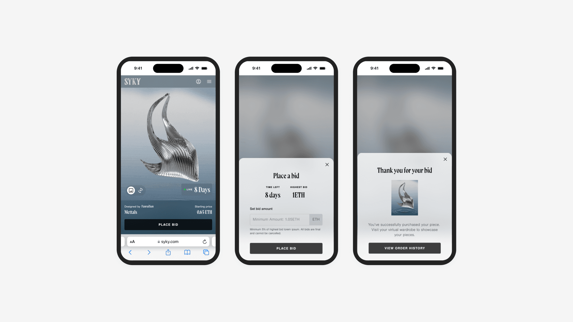
Design an E-commerce site with a drop feature, customisable collection page and secondary marketplace serving both digital and physical luxury fashion.
Role
Challenge
Challenge
Head of Product Design
Design a top-notch website that maintains flexibility to meet diverse designer asset needs, even in the face of tight deadlines and shifting objectives. Prioritise a visually captivating approach while ensuring an excellent user-friendly experience (UX). Implement key features like customisable collection pages, fiat payment, a secondary marketplace, and a seamless drop feature. Additionally, establish and deploy a brand guideline aimed at captivating new luxury fashion Web2 users, influencers, investors, and potential partners.
Design a top-notch website that maintains flexibility to meet diverse designer asset needs, even in the face of tight deadlines and shifting objectives. Prioritise a visually captivating approach while ensuring an excellent user-friendly experience (UX). Implement key features like customisable collection pages, fiat payment, a secondary marketplace, and a seamless drop feature. Additionally, establish and deploy a brand guideline aimed at captivating new luxury fashion Web2 users, influencers, investors, and potential partners.
Improving Usability and Refining the Design Process
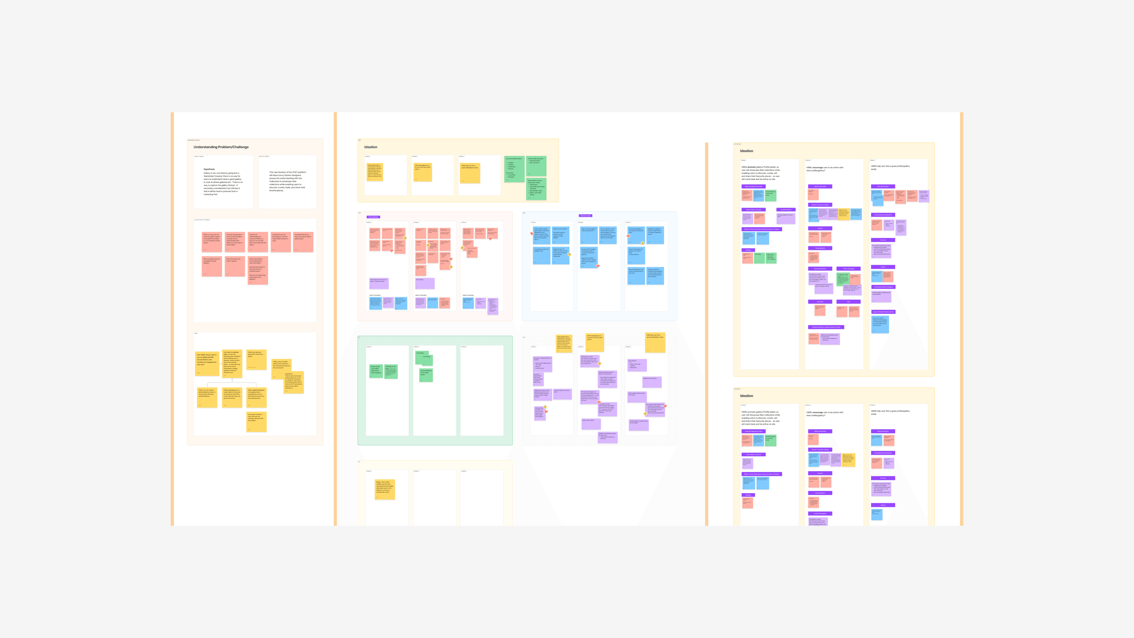
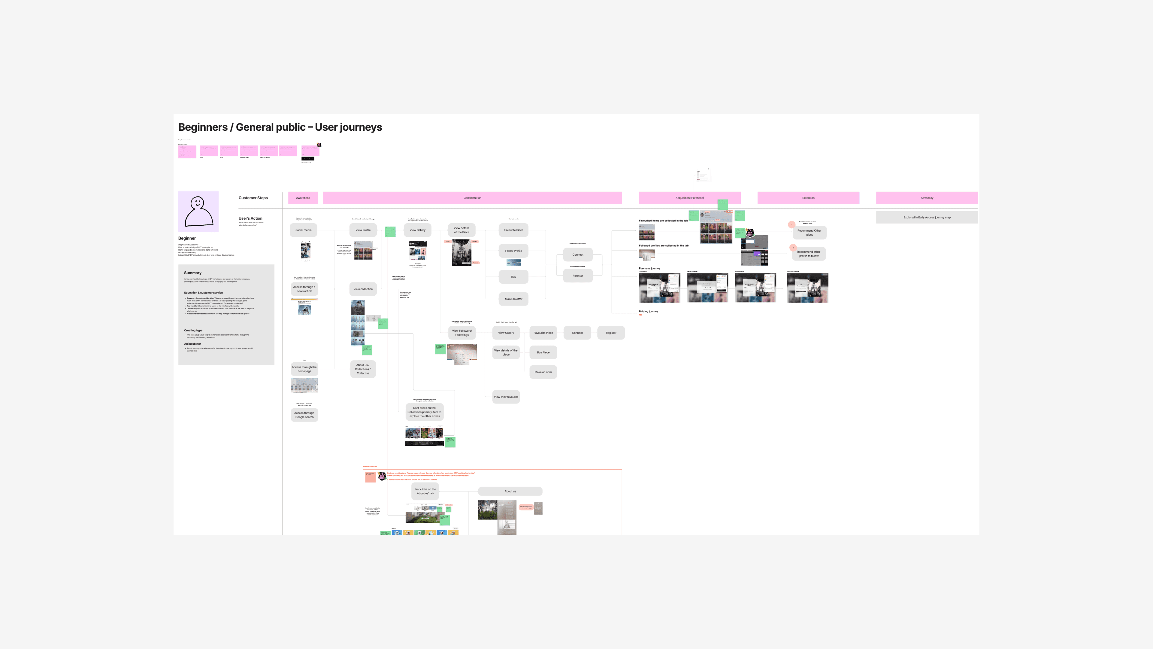
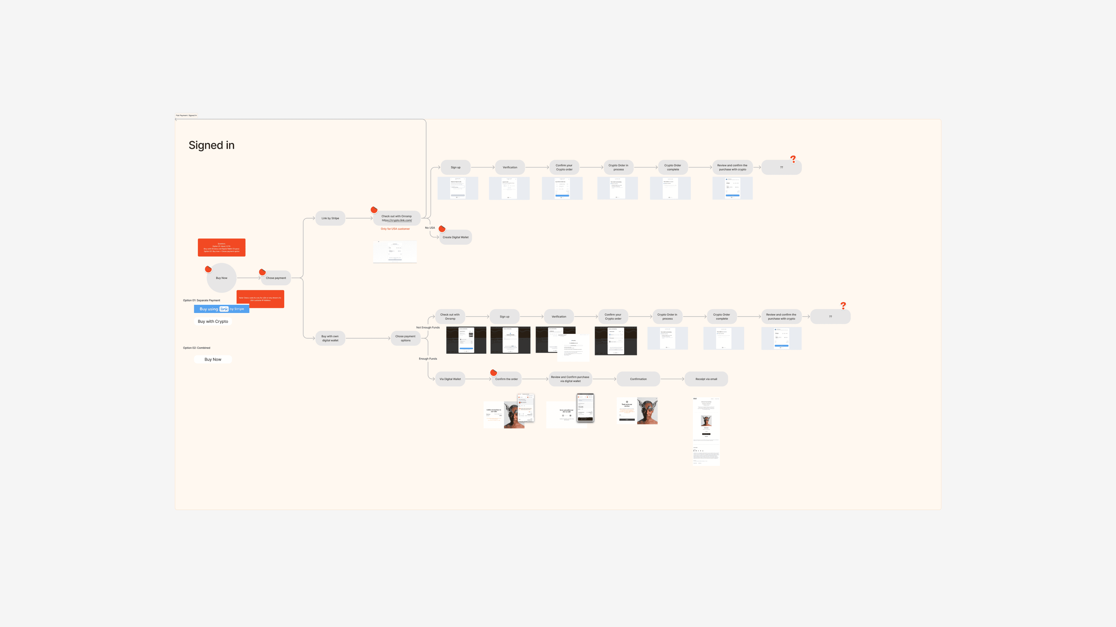
Designing a platform from scratch with a new team, many of whom were new to product design, presented challenges. Initially, we focused on visuals and neglected usability principles. To address this, I introduced an ideation process that prioritised mapping out the flow before creating wireframes. Since there were no clear product requirements, we had to define our own, which took extra time and effort. However, by emphasising user flow and usability early on, we aim to create a more intuitive and effective platform that meets our users' needs.
Click here to vie the prototype on desktop
Designed with system
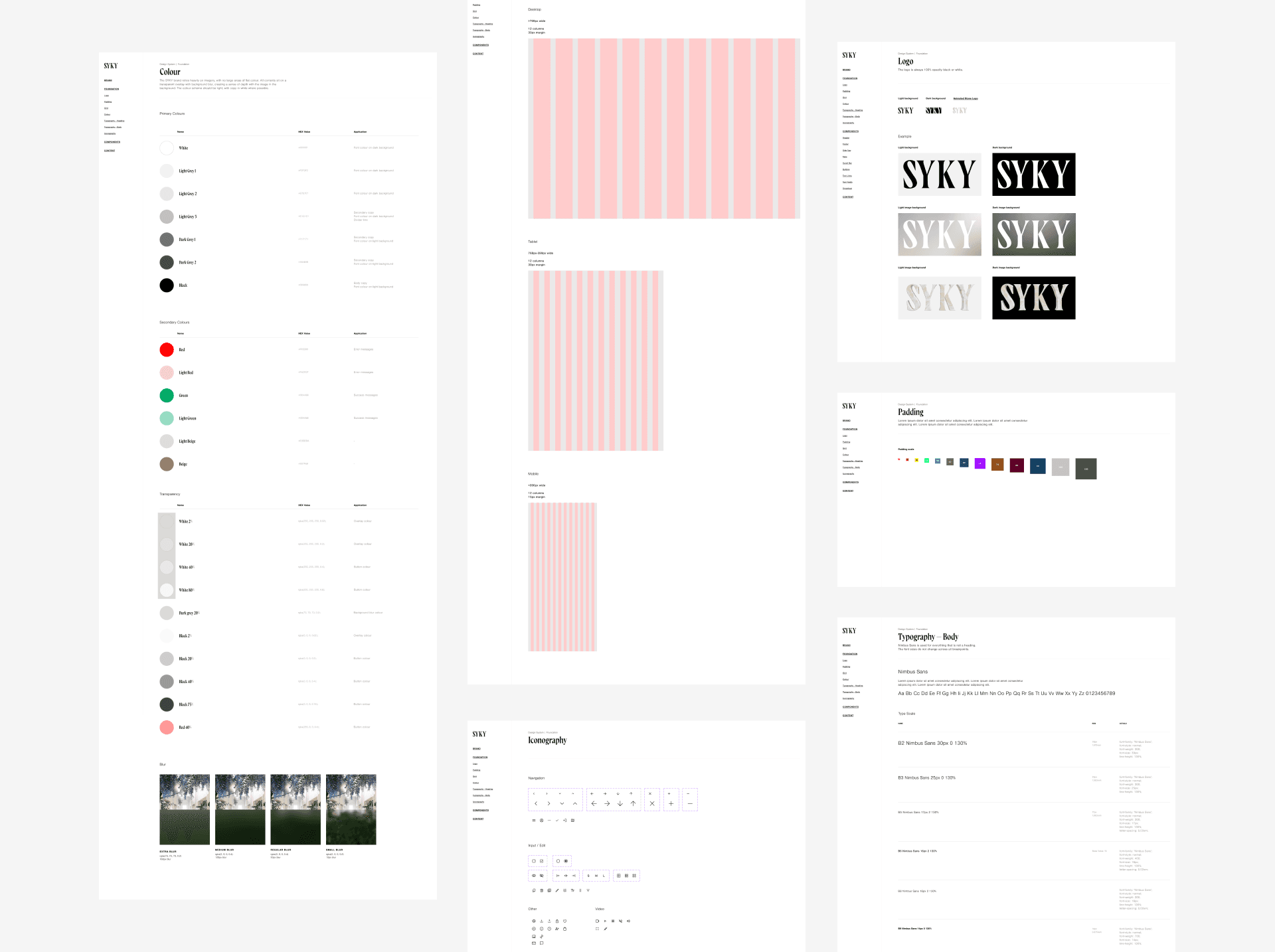
Defining all the essential elements during the design process was a challenge. However, this enabled us to facilitate quick and consistent design throughout the project, even when dealing with multiple changes involving contract designers and changes of requirements. Furthermore, coordinating style changes, later on, became easier as the Creative Team was provided with guidance to follow best practice UI patterns.
Next Step
The design system was initially created under time constraints and served its purpose in the initial stages. However, it may not fully reflect the brand's vision and identity.
The next step is to refine the design system based on launch feedback and testing, aiming for greater consistency with our brand language and an enhanced user experience.
Team
Role
Role
Product Designer x3 Creatives x3 Engineers x 6 Product Owner x 1
Head of Product Design
Head of Product Design
Team
Product Designer x3 Creatives x3 Engineers x 6 Product Owner x 1
Team
Product Designer x3 Creatives x3 Engineers x 6 Product Owner x 1


Challenge
Design a top-notch website that maintains flexibility to meet diverse designer asset needs, even in the face of tight deadlines and shifting objectives. Prioritise a visually captivating approach while ensuring an excellent user-friendly experience (UX). Implement key features like customisable collection pages, fiat payment, a secondary marketplace, and a seamless drop feature. Additionally, establish and deploy a brand guideline aimed at captivating new luxury fashion Web2 users, influencers, investors, and potential partners.
Click here to vie the prototype on desktop


Click here to vie the prototype on desktop
Improving Usability and Refining the Design Process
Designing a platform from scratch with a new team, many of whom were new to product design, presented challenges. Initially, we focused on visuals and neglected usability principles. To address this, I introduced an ideation process that prioritised mapping out the flow before creating wireframes. Since there were no clear product requirements, we had to define our own, which took extra time and effort. However, by emphasising user flow and usability early on, we aim to create a more intuitive and effective platform that meets our users' needs.







Designed with system
Defining all the essential elements during the design process was a challenge. However, this enabled us to facilitate quick and consistent design throughout the project, even when dealing with multiple changes involving contract designers and changes of requirements. Furthermore, coordinating style changes, later on, became easier as the Creative Team was provided with guidance to follow best practice UI patterns.


Next Step
The design system was initially created under time constraints and served its purpose in the initial stages. However, it may not fully reflect the brand's vision and identity.
The next step is to refine the design system based on launch feedback and testing, aiming for greater consistency with our brand language and an enhanced user experience.
To Be Studio: Product Design, Design Strategy & Direction
© 2023
© 2024
To Be Studio: Product Design, Design Strategy & Direction


